When I was decorating all of the “public” areas of our home, one of my main goals was to create a cohesive interior design throughout all of those areas. I didn’t need them to all look alike, or to have the exact same color palette throughout, but I didn’t want the rooms feeling choppy and disjointed. I wanted the house to feel like there was a general flow from one room to another.
That was the plan, and while my execution of that plan hasn’t gone perfectly (some of it took a whole lot of trial and error, while other areas still aren’t quite right and will need some tweaking in the future), I think I’ve pulled it off for the most part, and it started with the neutrals I used throughout the house and in almost every room.
I’ve seen a lot of houses where the cohesive design plan is done by painting the walls in every single room the exact same solid neutral color. There’s nothing wrong with that plan as long as that’s what the homeowner truly wants and likes. But that’s really not me, so I tried to use the same concept with a bit of a creative twist.
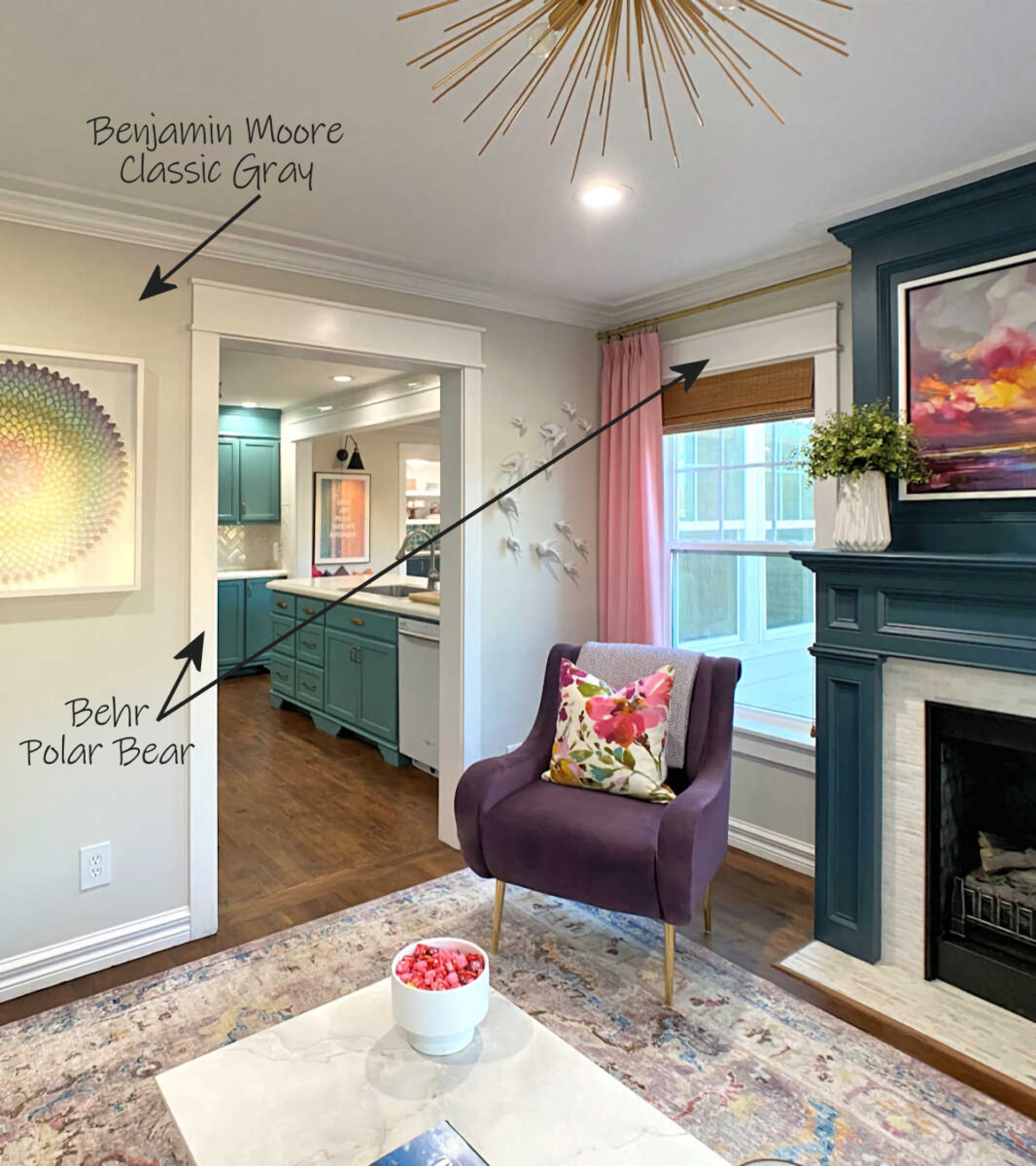
I’ve used the same two neutral paint colors in almost every “public” room of our house — Behr Polar Bear and Benjamin Moore Classic Gray. In the living room, the walls are Classic Gray and the crown molding, baseboards, window casings, and door casings are all Polar Bear.
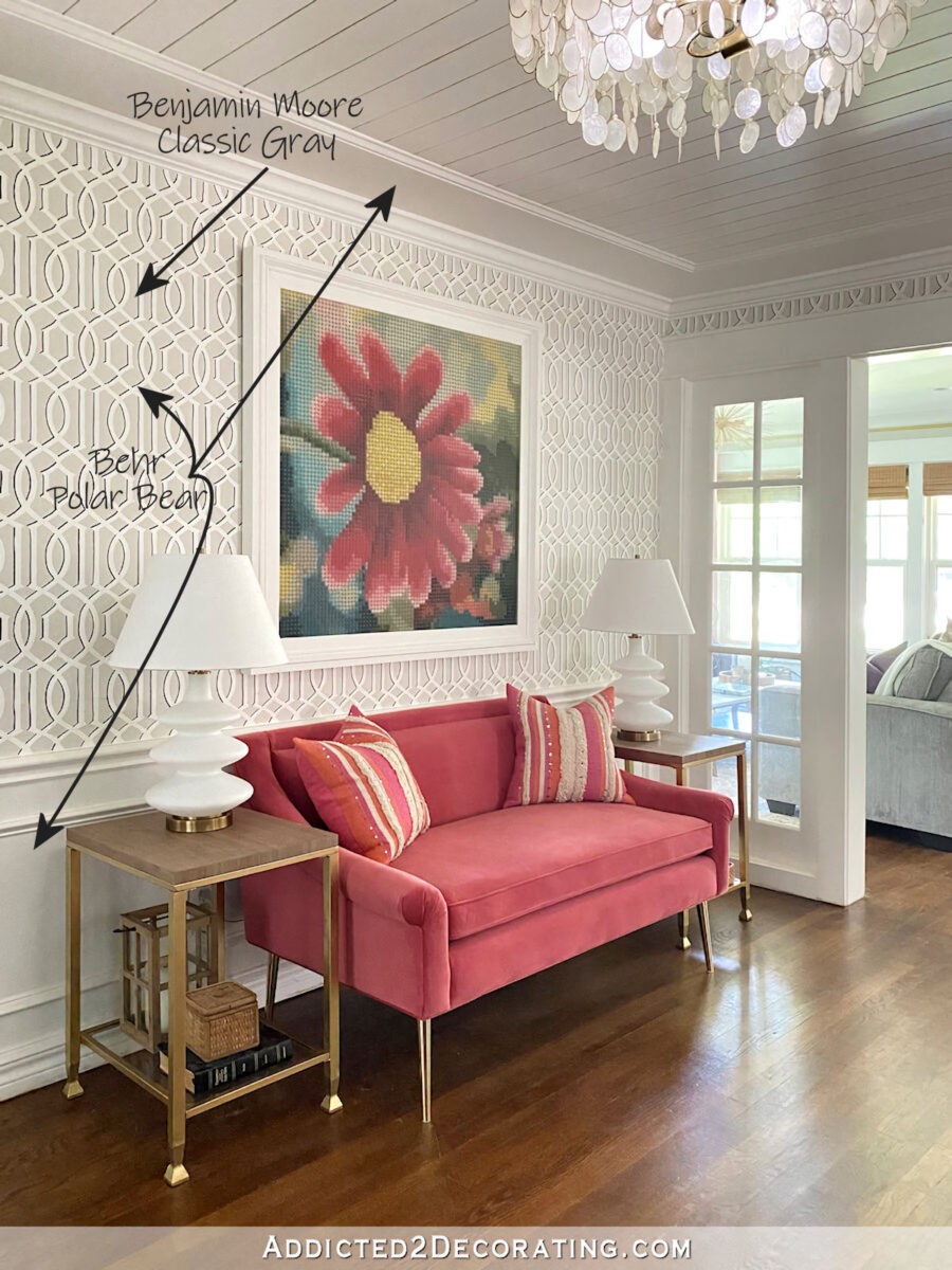
In the music room, which is right next to and open to the living room, I used the same colors with a twist. All of the trim in the room, including the slatted ceiling and wainscoting, is Polar Bear. Above the wainscoting, I stenciled the walls to create a wallpaper look, and I used both Polar Bear and Classic Gray for the “wallpaper”.
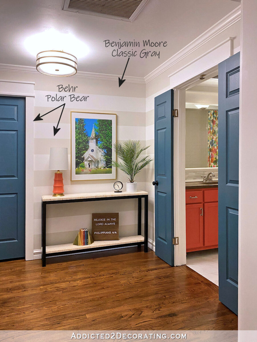
In the hallway, which is right off of the music room, I used Polar Bear on all of the trim and the built-in cabinet (which isn’t visible in the photo below). For the walls, I did a horizontal strip in Polar Bear and Classic Gray.
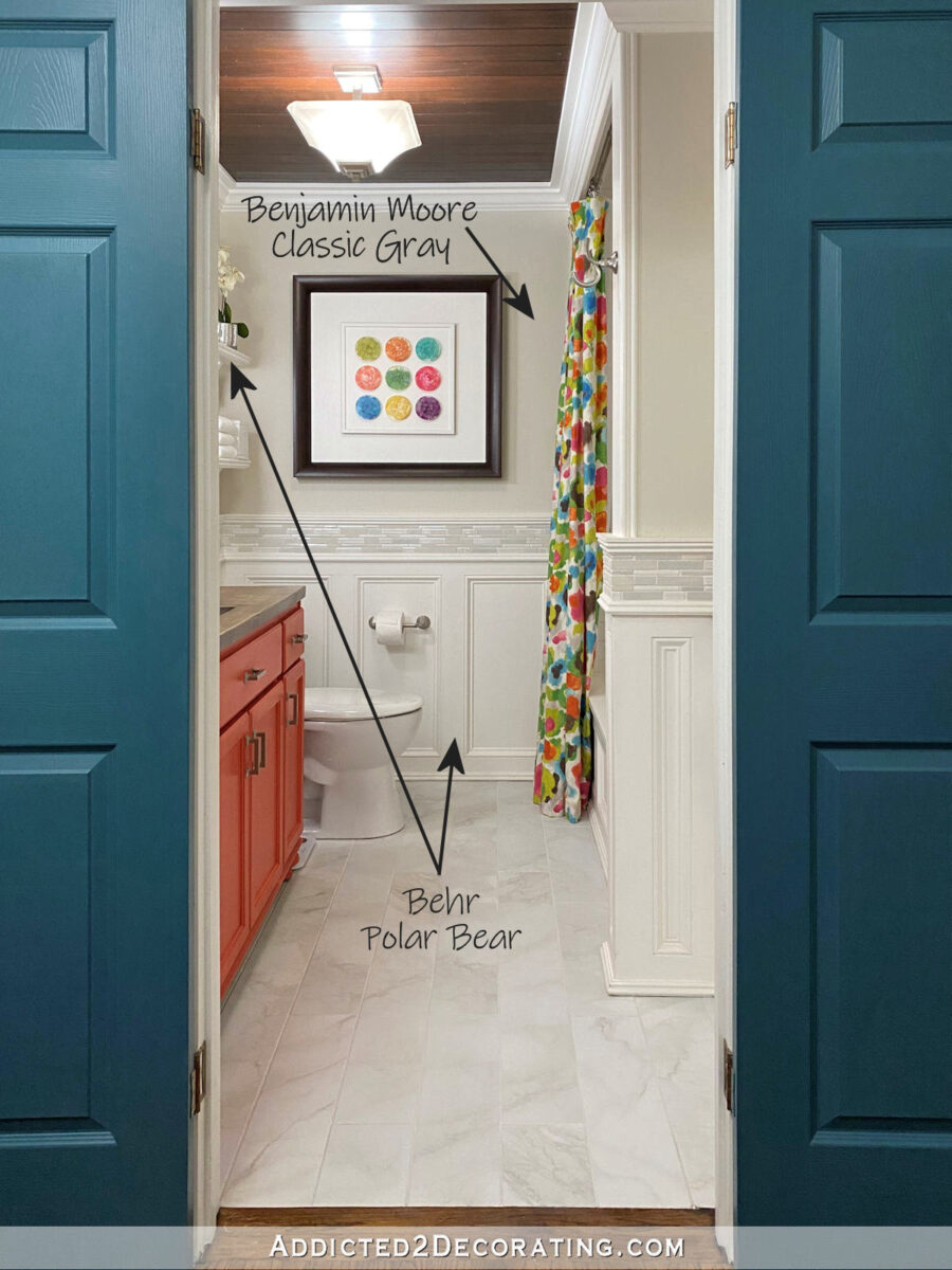
And then in the hallway bathroom, I used Polar Bear on all of the trim and wainscoting, and Classic Gray on the upper walls.
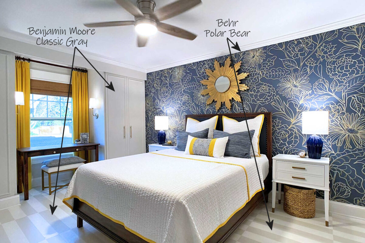
And finally, on this end of the house is the guest bedroom. I consider this a “public” area of the house because once we build our addition and have a proper master bedroom, the door to this room will remain open at all times (unless we actually have a guest using the room) and the room will be visible to anyone who enters the hallway. So in this room, once again, all of the trim is Polar Bear, and I used Classic Gray on the closets. Then I carried both colors onto the painted floor.
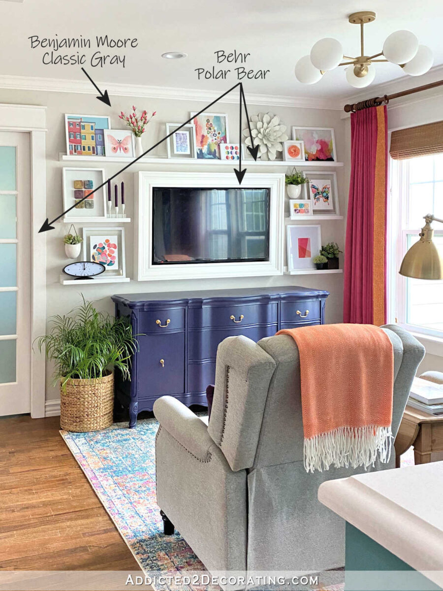
At the other end of the house (beyond the kitchen, which doesn’t have much paint except the painted cabinets) is the sitting room, where I used Polar Bear on all of the trim as well as the picture ledges and TV frame. Then I painted the walls Classic Gray.
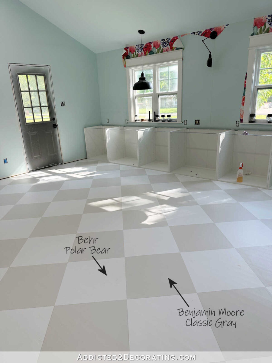
I’m still working on the details of my studio, and while it will probably end up being a bit more colorful than the rest of the house, I do consider it a “public” space as well, so I carried the Polar Bear and Classic Gray onto the painted floor in this room. Also, all of the trim in this room will be Polar Bear, and it’s very possible that the Classic Gray will appear somewhere else in here once all is said and done.
Once I created a canvas using those neutrals as a base, then I added lots of color to each room. I tried to keep them all somewhat similar, and in the same color families, so that the colors in one room wouldn’t look jarring against the next room. That doesn’t mean that they had to match exactly, just as long as they coordinated for the most part.
And that also doesn’t mean that I got everything right. As I mentioned above, there are areas that I plan to go back and tweak a bit. One area that I’ve mentioned in previous posts is the hallway bathroom vanity, which will then require a new shower curtaiin.
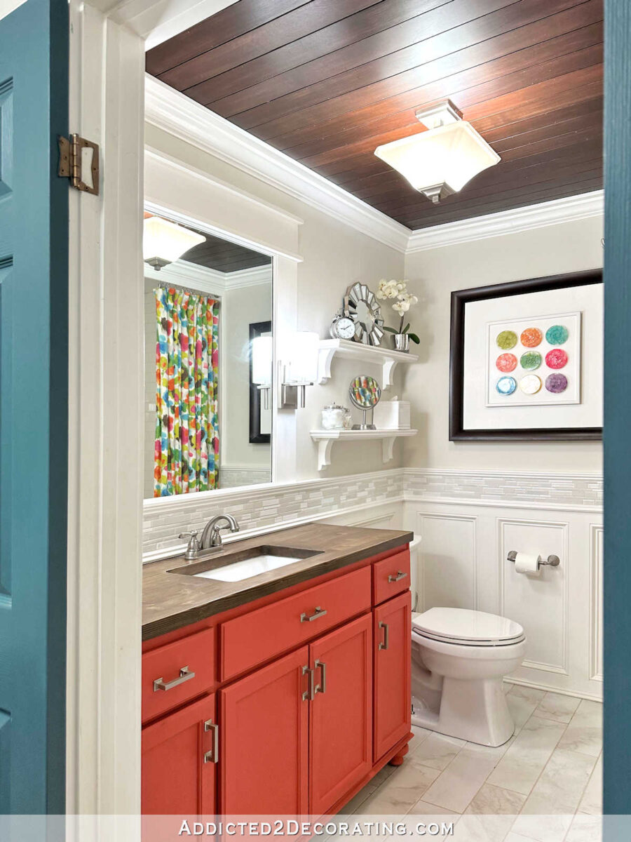
I like the color on its own, but this bathroom is visible from the music room (where I have a raspberry velvet settee) and the living room (where I have pink curtains). And this vanity is a little too orange to look cohesive with those colors. You can see what I mean here…
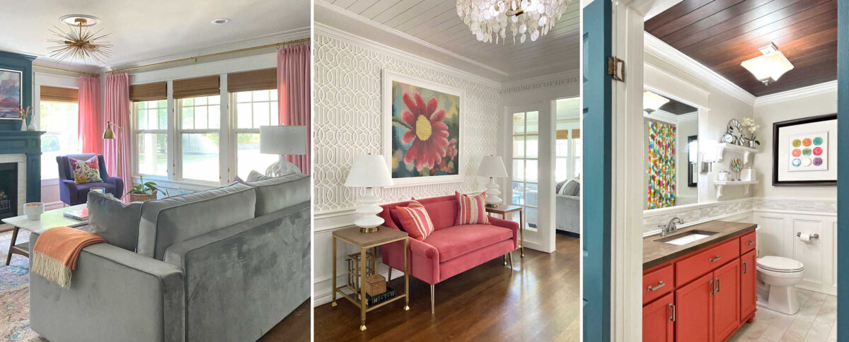
One of these things is not like the other. One of these things doesn’t belong. 😀 See what I mean? They don’t need to match. The music room settee and living room curtains don’t match. But to my eye, they don’t fight each other, either.
But the vanity is easily fixed with a quart of paint. And once I get that vanity color more in line with those two colors, where they play nicely together instead of fighting each other, the vanity will look just right with the rest of the house since it’s against that backdrop of Polar Bear and Classic Gray that runs through the rest of the house.
So that’s the process I used in my attempt to create a cohesive look throughout the house. But creating that cohesive look doesn’t have to end in all of your rooms with walls painted the same solid color. If you like that look, there’s absolutely nothing wrong with that. But if you’re like me, and you crave a bit more excitement and pattern, you can mix it up by using those same neutrals throughout the house in different ways — solid walls, stenciled walls, striped walls, striped floors, checkerboard floors, walls with standard trim, walls with wainscoting, etc.

Addicted 2 Decorating is where I share my DIY and decorating journey as I remodel and decorate the 1948 fixer upper that my husband, Matt, and I bought in 2013. Matt has M.S. and is unable to do physical work, so I do the majority of the work on the house by myself. You can learn more about me here.