I’m currently working on the paint swatch cabinet just inside the studio from the breakfast room door. If you missed my previous post about this, I’m using this cabinet makeover from Geneva Vanderzeil as my inspiration.
So after spending the weekend sanding, priming, and paint the door fronts white, I was finally ready to move on to the fun, colorful part of the project.

Now let me answer the question that I know many of you will inevitably have. If I started out with white IKEA Veddinge cabinet doors, why in the world did I sand, prime, and paint them white?
The reason I had to do that is because the original finish on the IKEA Veddinge cabinets and drawer fronts is super slick and shiny. And it is a very nice factory finish. So if I were to paint latex paint right over that original finish, it would just scrape right off. There’s no way a latex paint would stick to that original finish.
So even though I needed the doors to start off white, I had to sand, prime, and paint them with a paint that would actually accept additional layers of latex paint over the top without scraping off as if I had painted latex paint on glass.
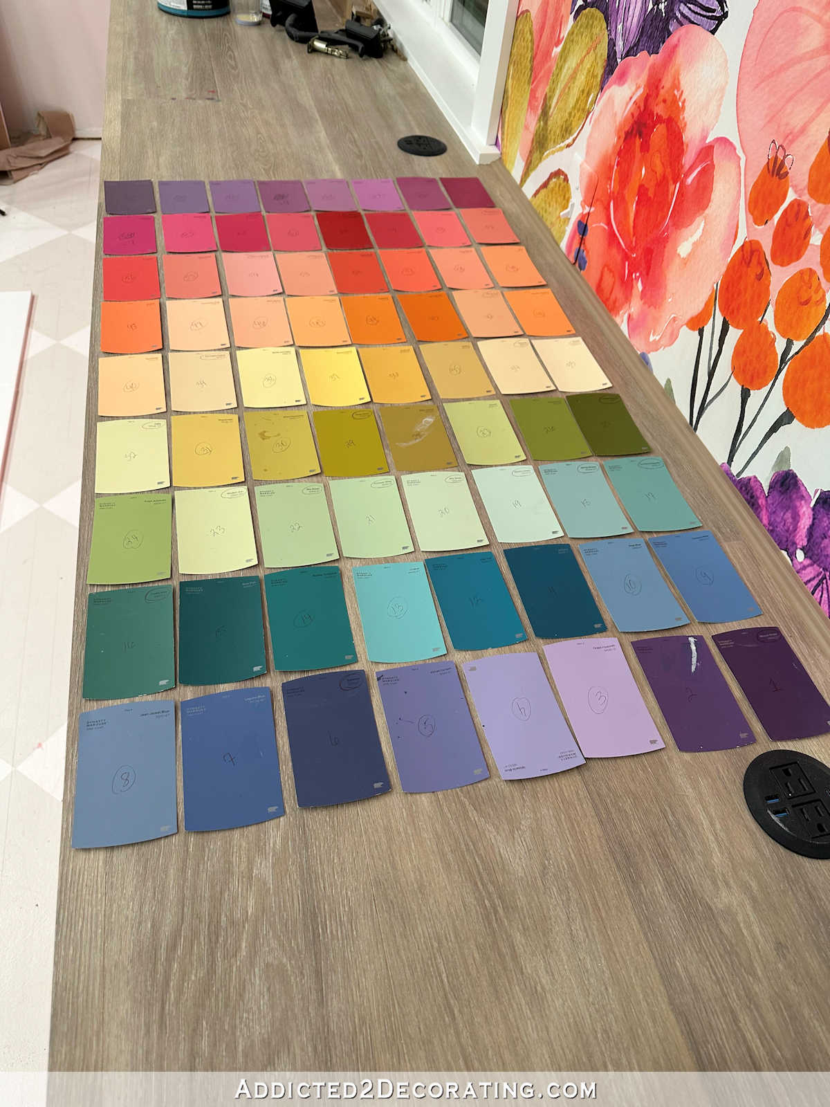
So after prepping the door fronts, I placed them on the floor as they would appear once they’re installed on the cabinets, and then began planning and marking off where the paint swatches would go. The doors for the top row are 20 inches high, the middle row doors are 30 inches high, and the bottom row doors are 40 inches high. And the entire things is 60 inches wide spanning four doors.
With those measurements, the layout that made the most sense and gave me uniform sizes from door to door, row to row, was to have eight colors across, and nine colors down.

My markings in the photo above will probably only make sense to me, but that’s not what’s important. Let me repeat. I ended up with eight colors across and nine colors down.
Eight times nine. That’s 72 colors! Even after marking those off, and writing down that I needed eight across and nine down, it didn’t really sink in that I was talking about using seventy-two paint colors until I actually got to Home Depot to pick them out.
SEVENTY-TWO PAINT COLORS!!! 😀 Don’t get me wrong. I’ve got no problem using 72 paint colors (or 100, or 250) on a project. The more colors, the better, as far as I’m concerned. But have you ever tried to pick out 72 paint colors from one end of the spectrum to the other to create a somewhat coordinating gradient? Ummmm….it’s not easy.
Well, let me take that back. It would have been incredibly easy had I just been able to pick out 72 random colors from the Behr display, starting at one end and ending at the other end, and then purchase al 72 in sample sizes. But that would have cost $466. There was no way I was going to pay $466 on 72 paint samples. Plus, they didn’t even have that many paint samples in stock. I asked, because during one insane split second, I actually considered it.
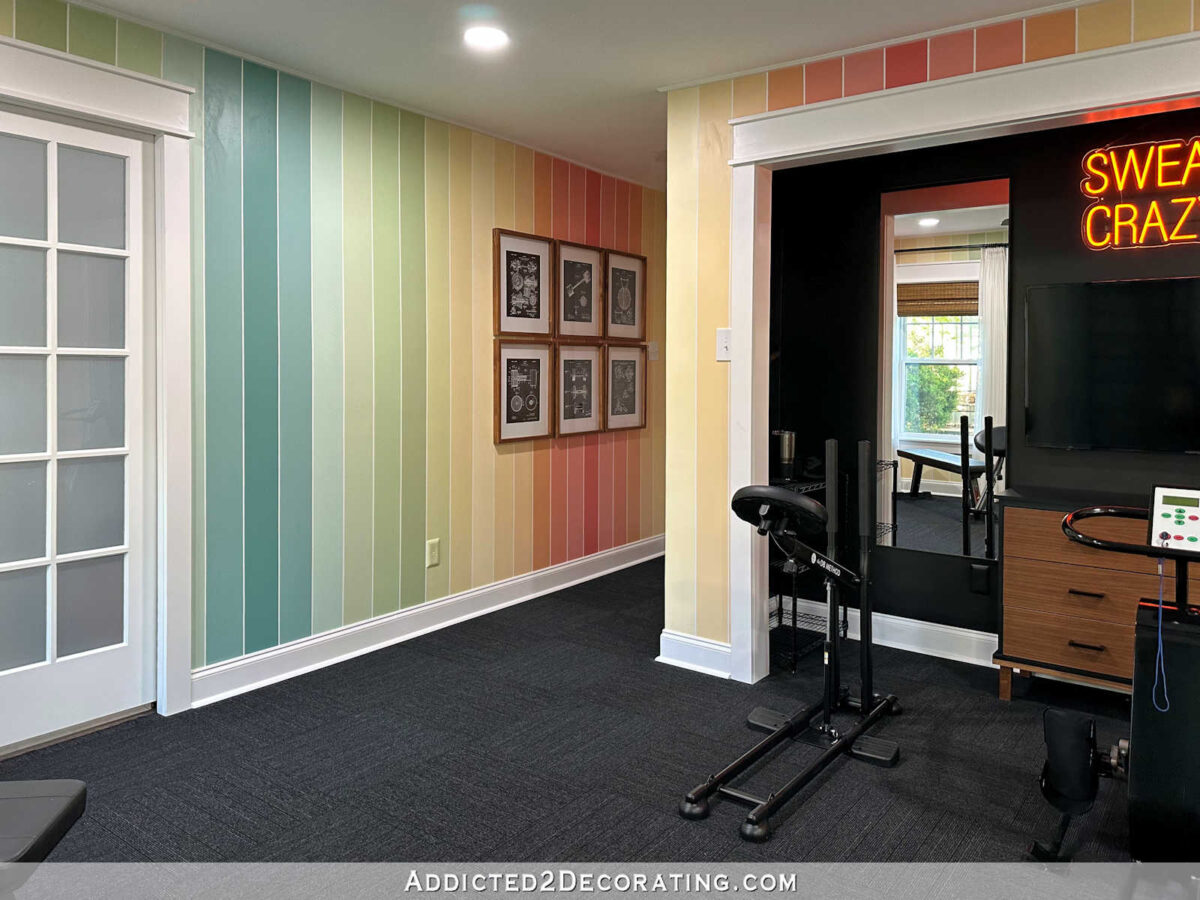
So in order to save money, I wanted to incorporate all (or most) of the colors I knew I already had on hand. For example, I already had 15 colors that I used on our home gym walls.
I also had seven brand new quarts that I purchased several months ago for a project that I changed my mind on and never did. So after taking inventory of those, and determining that I already had 22 colors that I could use on these cabinets, I headed to Home Depot to fill in the other 50 that I needed. So that’s really what made it complicated — having to use those 22 and fill in with 50 more while trying to make the gradient look somewhat cohesive.
But I did it! And it only took me about an hour-and-a-half. 😀 It was a fun challenge, and I ended up with 72 pretty great colors.

Then I had to separate them out into three categories. There was still no way I was going to buy 50 paint samples. Not only would that have cost $323.67 (still way to much), but again, they didn’t even have that many paint samples in stock. So I separated the 72 colors into (left) the 22 colors I already had at home, (right) the colors I thought I could mix myself, and (center) the main colors I needed to purchase in order to mix the rest of the colors. I ended up needing to purchase 17 samples, which cost $110. That seemed like a reasonable price to me.

Here are the 17 samples that I ended up purchasing. You can see that they’re the deeper, darker, more saturated colors. I figured that if I had the main deeper, more saturated colors in the gradient, I could use those to mix with white, mix with each other, etc., to create the other 33 colors that I needed.

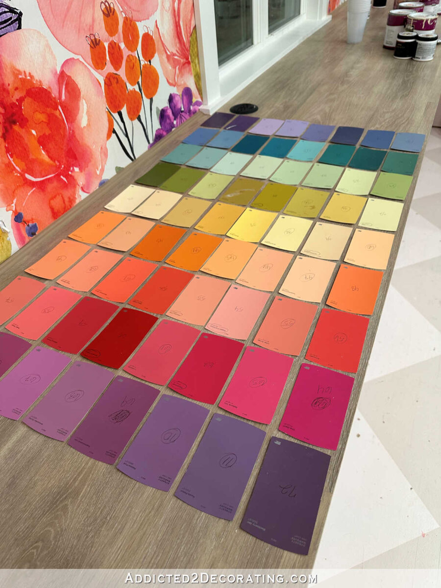
While at Home Depot, I numbered all of the 72 swatches so I could easily keep them in order. I didn’t want to have to reorganize them from scratch in that gradient again. So when I got home, I lined up the paint swatches in order across the long countertop in the studio.
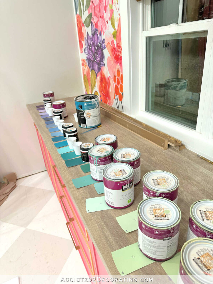
And they stretched from one end to the other, plus about nine in a second row on the back. And then I organized the paints that I already had on the matching swatches. On the other 33 that I didn’t already have paint for, I placed a cup so that I could mix those paints using the other paints.

Let me show you a couple of examples. You can see that I purchased a sample of color #2, which is a darker purple. I didn’t purchase color #3, the lighter purple, because I could make that color using the darker purple mixed with lots of white.
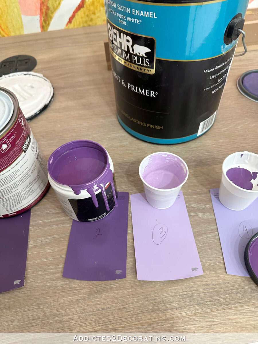
The next color, #4, is also a light purple, but you can see that it has just a touch of blue in it. So I mixed a lot of white, some of the #2 dark purple, and just a touch of the dark #6 blue.

Color #5 above also appeared to be a light purple, but it’s darker and has quite a bit more blue in it than the previous color. So I mixed a lot of white, more of the #6 dark blue, and just a touch of the #2 dark purple. And that’s how I went along until the rest of the 33 colors had been filled in.
So let me show you all 72 colors, and how they will appear on the cabinets. It starts with purple and ends with purple, and spans the entire spectrum in between. I’m not quite sure if I’ll put the colors on the cabinets so that they look like this, with the purple and then the pinks at the top…

Or if I’ll put them in this order, so that the colors go from purple at the top to blues and teals.
And here’s what they look like with the mural. I think they complement the mural beautifully! Of course, these colors won’t be near the mural. They’ll be on the wall opposite the mural wall.

It took a whole lot of prep work to get the doors prepped for paint, and then to mix those paint colors. And I still have to tape off all of the rectangles on the cabinet doors before I can get started painting. But I’m almost giddy with excitement about these cabinets. I may even like this one more than my pink cabinets! I mean, for someone who loves color as much as I do, can you think of anything dreamier than a section of cabinets painted with 72 different colors?! I’m so excited about this. 😀

Addicted 2 Decorating is where I share my DIY and decorating journey as I remodel and decorate the 1948 fixer upper that my husband, Matt, and I bought in 2013. Matt has M.S. and is unable to do physical work, so I do the majority of the work on the house by myself. You can learn more about me here.