
In case you haven’t heard, we’re going to turn our current home gym into our bedroom. So I’ve been trying to put together a decorating plan for that room so that I’ll be ready to implement it as soon as the new floor and subfloor have been installed and I’ve had a chance to stain and seal the new floor. And since grasscloth is probably my favorite of all wallcoverings, and this might be my last chance to use it, I’m about 85% sure that I’ll be using grasscloth in our bedroom.
If I’m going to do grasscloth, it has to be teal…obviously. I wouldn’t even consider another color. So I ordered five different samples from two different companies, and I’ll show you what they look like. I wanted to see what they look like in the bathroom because, while I don’t need the grasscloth I choose to match the bathroom, I also don’t want it to clash with what’s going on in there. Immediately, I thought that two of them could be ruled out, leaving me with three choices. And of those three choices, I immediately loved one of them far more than the other two.
Here’s a look at all five. Can you guess which one was my favorite?

I’ll go in order and tell you my thoughts. This first one is one of the three finalists. This is Gallant Grasses Crown Jewel by Phillip Jeffries. I love the texture and the overall color. What I don’t like is that the lightest background color almost looks fluorescent in person. It demands way too much attention. If that background color was toned down a bit, this grasscloth would probably be my favorite.

I was really hoping that this second one would be the one because it’s the only one that’s actually vinyl, which means it’s very easy to clean. This is Madagascar Raffia Emerald Sea by Phillip Jeffries. It has a beautiful texture, so it looks like the real thing. Unfortunately, it’s too green for my taste, so I ruled it out. I prefer my teals to be more on the blue side with a touch of green mixed in. This one looks like it’s on the green side with a touch of blue mixed in.

Next up is Juicy Jute Tantalizing Teal by Phillip Jeffries. This is the exact grasscloth that I used to have on the entryway wall. And then I used it on the drawers of the console table in the entryway. Since I’ve actually used it before, I know I love it, which is why it’s obviously in the final three.

Next up is this Deep Teal Blue Heavy Bamboo grasscloth. I had high hopes for this one because I love this type of grasscloth with the flat, wide bamboo strips. But the color is completely off. It has way too much green in it, and the overall color is too flat and lifeless. There’s no vibrancy to it at all, so I ruled this one out almost immediately.

And finally, there’s this beauty. This is called Cool Teal Sisal Grasscloth. I wasn’t expecting much from this one, and I almost didn’t order it, because on the product listing page it looks so green. And I like my teals on the blue side. I’m so glad I went ahead and ordered it, though, because it’s the perfect teal! In person, it’s absolutely stunning.

I’m pretty sure that’s the grasscloth that is shown in this image from the home page of that website:

I know it looks a lot lighter and brighter in my photo, but that’s because I took the photo at night and had all of the lights turned on. In person, and depending on the lighting, it does have that deep, dark, rich look to it.
Here’s a look at all five against the mural again. The contenders are 1, 3, and 5. And I guess I’ve already given it away, but the last one is my favorite. It’s not the one that matches the mural the best, but again, I don’t need it to match. It’ll be in the next room. I just don’t want it to clash, and I think that the last one complements the bathroom nicely.

Here’s a look at all five against the wall. This was taken at night with all of the lights turned on.

I took a couple more pictures this morning after the sun came up because colors look a little different in that light.

And here’s another look at them against the mural in the morning light.

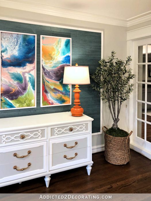
If my goal were to choose the one that matched the bathroom the best, I’d go with Juicy Jute Tantalizing Teal (the middle one), which is the one I’ve used before. Here’s what it looked like in the entryway.
It’s definitely a very pretty grasscloth. But next to that last one, it doesn’t even compare. That last one has a richness and depth of color to it that all of the others lack.
If I were to choose today, I’d go with that last one. I can just picture it with white wainscoting, those gauzy white curtains, a beautiful upholstered headboard, etc. I think it’ll be beautiful, right? Or do you think I’m making a mistake by not going with the one that more closely matches the bathroom?

Addicted 2 Decorating is where I share my DIY and decorating journey as I remodel and decorate the 1948 fixer upper that my husband, Matt, and I bought in 2013. Matt has M.S. and is unable to do physical work, so I do the majority of the work on the house by myself. You can learn more about me here.